We are open by appointment Monday to Friday from 9am to 5pm. To schedule an appointment, please email your request to asc@torontomu.ca or fill out our appointment form .
Do you know the Yellow Nineties 2.0 database? It is an open-access resource dedicated to the study of eight late-Victorian “little magazines” produced between 1889 and 1905. The brief period is known as the “Yellow Nineties” after The Yellow Book, a controversial quarterly publication that embodied the “decadent” culture of the fin de siècle.
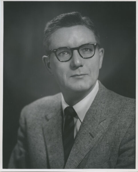
Toronto Metropolitan University professor Lorraine Janzen Kooistra spearheaded the Yellow Nineties 2.0 website, a digitization project that has evolved into a world-class online database composed of searchable editions of each publication, a database of textual ornaments found in the issues, peer-reviewed essays on the “little magazine” contributors and much more research on the period and the people who produced these works. The scholarly site is dedicated to the study of The Yellow Book, The Dial, The Pagan Review, The Evergreen, The Savoy, The Pageant, The Green Sheaf and The Venture. Many of the physical publications held at Toronto Metropolitan University Libraries Special Collections were digitized to create online versions for the database.
To celebrate the Yellow Nineties 2.0’s completion, TMU’s Special Collections is hosting an exhibition until the end of April 2024 showcasing the Victorian “little magazines” in our holdings.
Over the years, the “little magazines” held in Special Collections alongside the Yellow Nineties 2.0 database have facilitated interactive student workshops and research creation through TMU’s English department among other partnerships on campus. Explore the Y90s Classroom website to learn more about the research and exhibitions created using these collections.
Student have shared their initial reactions after being introduced to the Yellow Nineties 2.0 and the physical copies held at TMU Special Collections below:
What a treat to hold a piece of art and literary history in your hands! Interacting with the collection online and in person is like night and day – they complement each other. While the online collection is wonderful for facilitating remote research, these magazines truly are art objects and must be appreciated in their proper, corporeal form. Nothing can compare to the opportunity to interact with the item itself. It’s a tremendous privilege to reach into the past and touch the same pages that were lovingly designed, printed, and bound, by literature lovers of the past. While there are no time-machines at TMU, historical literary collections are the next best thing.
History preserved in time—a glimpse at the lives and creative pursuits of those who lived over a century before us.
It was very interesting to me that quite a large amount of the pages in some of the magazines were white, compared to present-day magazines which cover every single empty space with something. This really allows the reader to focus their attention on the sole thing that the page is presenting to them, whether it be a short story, a poem or a piece of art.
To view the current exhibition 1890s Little Magazines: Art for Art’s Sake in Print , visit us on the 4th floor of the TMU Libraries Building. The current exhibition, available until April 30th 2024, features several of the “Little Magazines” held at TMU Special Collections, including The Dial, The Yellow Book, The Evergreen, The Savoy, The Pageant and The Venture.
After the great success of the Kelmscott Press under the direction of William Morris (1834-1896), artists and bookmakers recognized that there was a niche audience willing to buy expensive books with daring or progressive subject matter as long as they were beautiful.
This change in the notion of the reading public, its taste and, particularly, its morality, liberated artists to make increasingly exotic books and periodicals. The ‘little magazines’ of the 1890s sprang up in this context. Beautifully designed and illustrated, they embody a different set of values from those we associate with Victorian orthodoxy: celebrating gendered, sexual, regional, or social alternatives.
Printing changed in the 1890s, starting with the Pre Raphaelite concept of total book design, and the Arts & Crafts return to artisanal craftsmanship. High-quality volumes could be sold for very high prices and no longer needed a mass audience in order to become financially viable productions. First-rate artists were drawn from the canvas to the page as technological developments gave them more control and the development of a niche, connoisseur audience gave them more thematic flexibility. The “Little Magazines” of the 1890s are among the most prized results: an outburst of sophisticated, beautiful publications by the most talented, avant-garde artists of the Aesthetic Movement.
The current exhibition, available until April 30th 2024, features several of the “Little Magazines” held at TMU Special Collections, including The Dial, The Yellow Book, The Evergreen, The Savoy, The Pageant and The Venture.
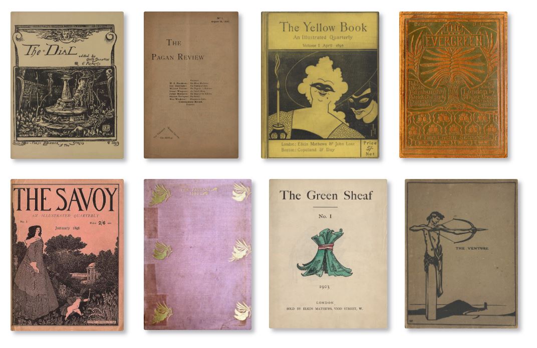
The Dial: An Occasional Publication (5 issues, 1889-1897)
Produced by joint editors Charles Ricketts (1866-1931) and Charles Shannon, The Dial featured art and literature, much of it produced by a core bohemian circle who congregated at Ricketts and Shannon’s home. Unlike most Art Nouveau magazines, The Dial prominently features wood engraving and lithography, illustrative techniques in which the artist controls the means of production. Although only five issues were produced by a small group of artists for a niche audience. the artisanal integrity and harmonious design of The Dial had a major impact, influencing a revival in wood engraving and leading to Ricketts’s founding of The Vale Press (1896-1904).
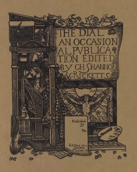
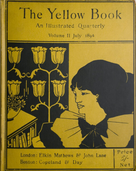
The Yellow Book: An Illustrated Quarterly (13 issues, 1894-1897)
The Yellow Book embodies the “decadent” culture of the fin de siècle. Aubrey Beardsley (1872-1898) proposed a quarterly that would focus equally on art and literature to the publisher John Lane (1854-1925) with Beardsley as art editor & principal artist while Henry Harland (1861-1905) acted as literary editor. Taking the colour yellow as a nod to risqué Continental literature and producing grotesque and suggestive images designed to shock the uninitiated, Beardsley courted controversy and found it. Fearful of Beardsley’s association with Oscar Wilde (1854-1900) when the latter was arrested for “gross indecency,” Lane fired Beardsley. The change from daring to conservative content that starts with the fifth issue highlights Beardsley’s impact on the early volumes.
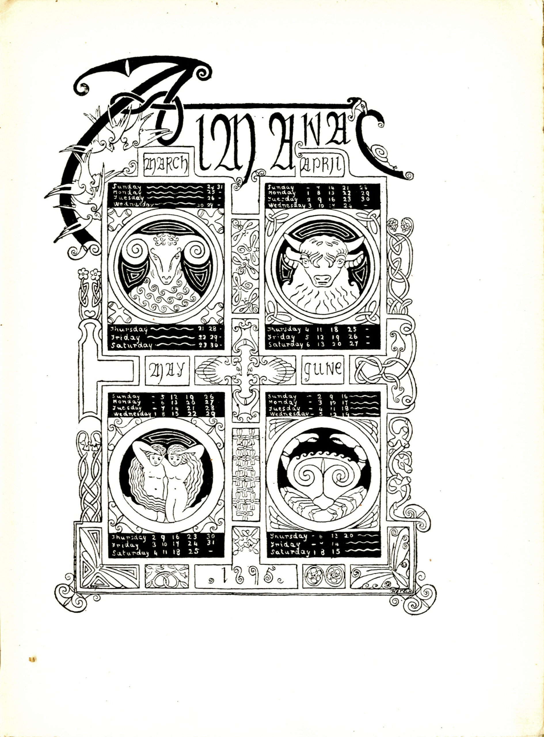
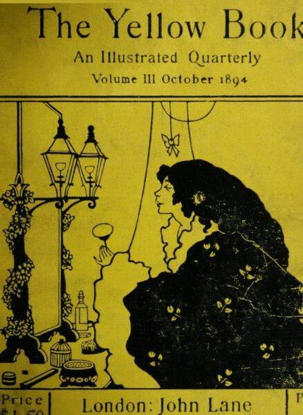
The Evergreen (4 issues, 1895-1896/7)
Reflecting the diverse concerns of its polymath sponsor, Patrick Geddes (1854-1932), The Evergreen blends interests in ecology and urban renewal with a celebration of the Scottish Renascence and the Celtic revival.
These conservationist & post-colonial priorities are manifest in the periodical’s appearance, particularly its type. The Evergreen was printed by Edinburgh’s foremost arts-and-crafts printer, Walter Blaikie (1848-1928), and deliberately revives Celtic art in its ornaments. Copies bearing the coloured leather bindings designed by Charles Mackie (1862-1920), with a stylized tree on the upper cover, are especially prized.
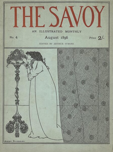
The Savoy (8 volumes, 1896)
When Aubrey Beardsley was fired from his role editing The Yellow Book, Leonard Smithers (1861-1907) seized the opportunity to enlist the talented artist. Like The Yellow Book, The Savoy combined art and literature, and adopted the format of the book, with stiff board covers, high-quality paper, and fine illustrations. In its pages, we can trace Beardsley’s departure from the influence of Japanese woodcuts to the rococo style of 18th-century France, with much more fine detail and texture. After two quarterly issues, Smithers retooled The Savoy as a monthly magazine, changing its format, streamlining the contents, and lowering the price. Although it ultimately failed to find an audience, it is a remarkable attempt to extend avant-garde art to a wider public.
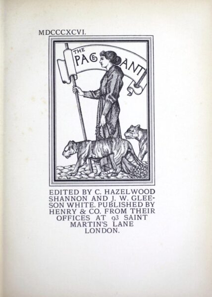
The Pageant (2 volumes, 1896 & 1897)
Edited by Charles Shannon (1863-1937) and Gleeson White (1851-1898), The Pageant connects the little magazines to the earlier genre of the Christmas Annual. Like the Ladies’ Annuals that had been a dominant genre in the book market in the 1830s, The Pageant offered reproductions of famous works of art in print. Unlike its predecessors, this avant-garde journal had a distinctly sophisticated & intellectual array of content, including art history, ancient myth, modern western culture, and decadent cosmopolitanism. In this respect, The Pageant connected the Aesthetic movement to a long tradition of European art.
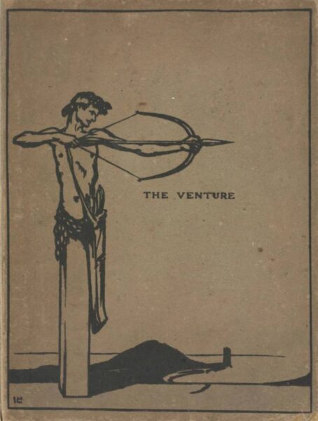
The Venture: An Annual of Art and Literature (2 issues, 1903-1905)
The Venture was published by gallery owner John Baillie (1868-1926) and edited by Laurence Housman (1865-1959) and W. Somerset Maugham (1874-1965). Determined to make The Venture into a “book beautiful”, Baillie enlisted James J. Guthrie (1874-1952) to print the letterpress and wood engravings of the first volume and Bernard Newdigate (1869-1944) to print the letterpress for volume two in collaboration with specialists in etchings, line blocks, lithographs, and photogravures. The Venture is beautiful and notable for its high literary quality, but failed to find a large audience. As its title indicates, producing a high-brow annual was always imagined as a risk.
The Canadian Community Cookbook Collection contains over 250 community cookbooks, culinary textbooks, and company publications related to food products dating from 1888 to the early 2000s. It was donated to Special Collections in 2021 by Dr. Ian Mosby, a faculty member from TMU’s Department of History.
We are featuring an assortment of cookbooks in this blog, as well as in the display case on the 4th floor of the Libraries, to highlight the wide range of genres within culinary publications. We hope that these windows into Canadian culinary history, and especially the festive recipes, will inspire you to try making a new dish, or watch the Great Canadian Baking Show during the winter break!
A large portion of the collection is made of community cookbooks. These were created by women’s associations, church groups, hospitals, and community groups for fundraising purposes. They compile and publish recipes from community members and include the contributor’s name in the cookbook. These are simple publications, and would often offset printing costs by including advertisements for local businesses.
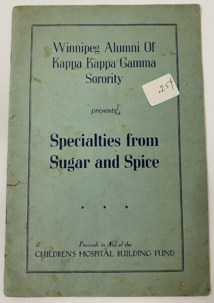
Specialties from Sugar and Spice (1948)
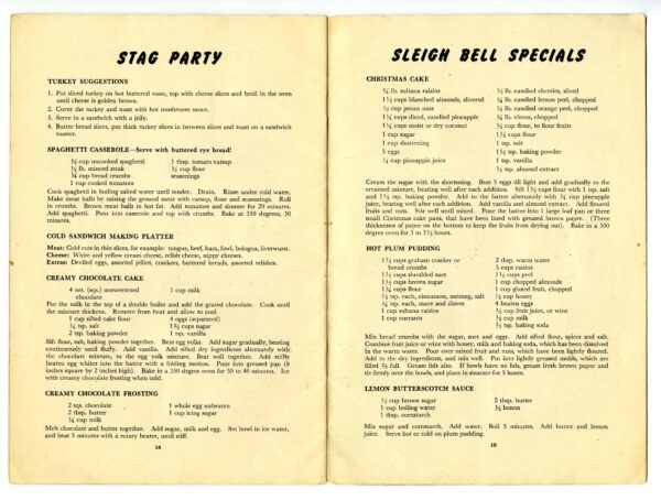
Recipes from Specialties from Sugar and Spice (1948)
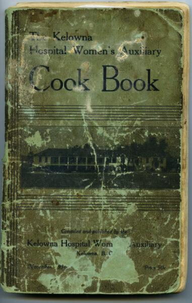
The Kelowna Hospital Women’s Auxiliary Cook Book : a collection of tried and tested recipes (1936)
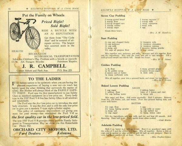
Local advertisements and recipes from The Kelowna Hospital Women’s Auxiliary Cook Book (1936)
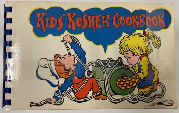
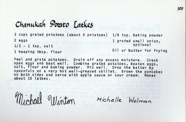
Kid’s Kosher Cookbook
Latke recipe from the Kid’s Kosher Cookbook
Another genre is advertising cookbooks. These were published by food companies, such as gelatin, flour and corn starch producers. They often include detailed photographs or illustrations of dishes that can be made using their products. Since these were used for marketing purposes, they can help us understand trends in culinary styles and kitchen technologies.
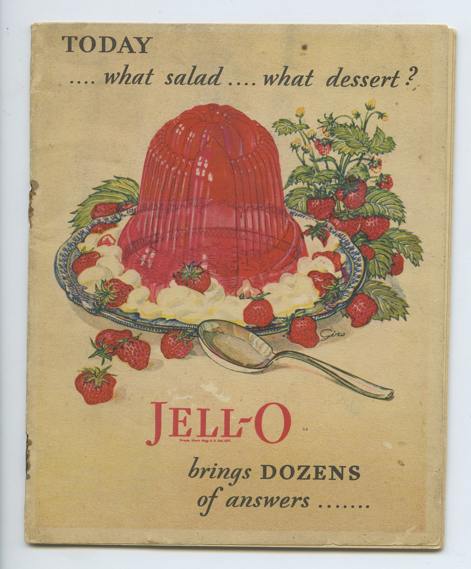
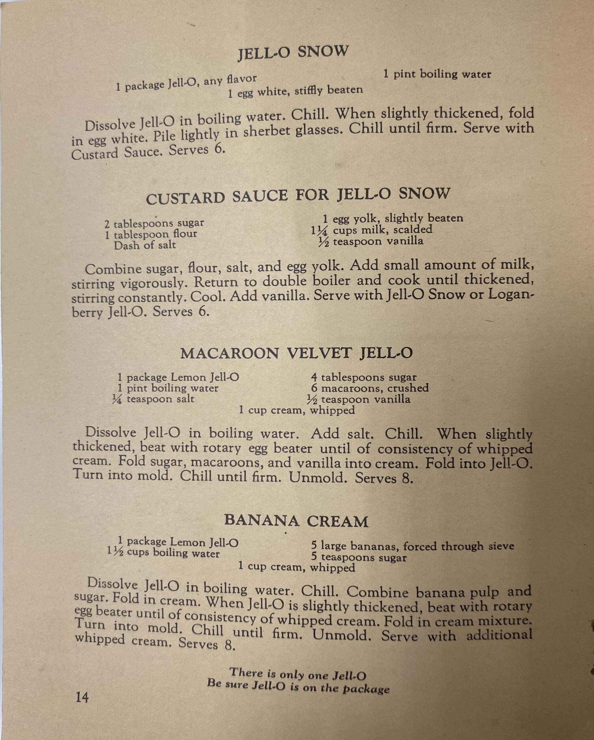
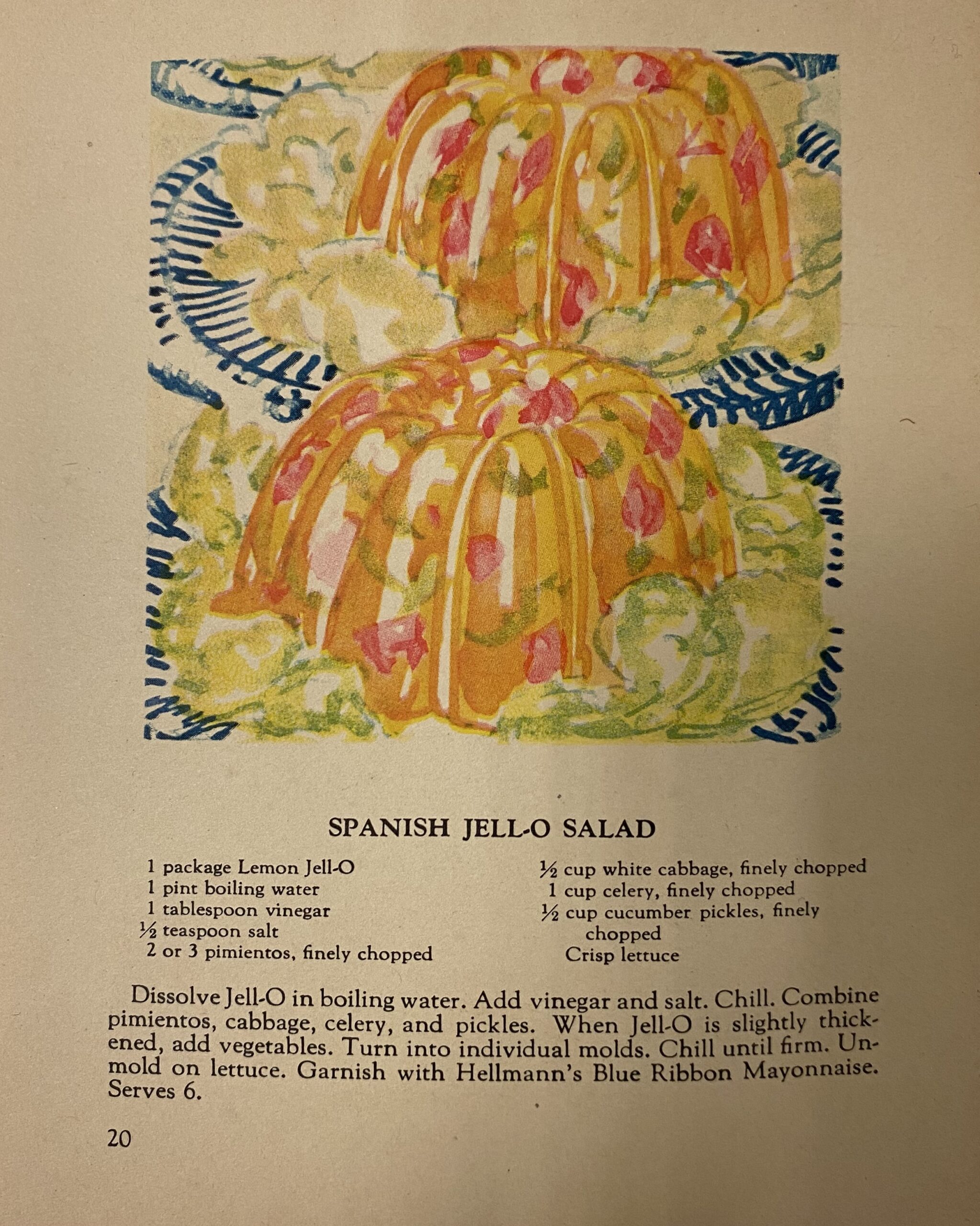
Today …. what salad …. what dessert?: Jell-O brings DOZENS of answers…. (1928)
Desert recipes from Jell-O brings DOZENS of answers… (1928)
Salad recipe from Jell-O brings DOZENS of answers… (1928)
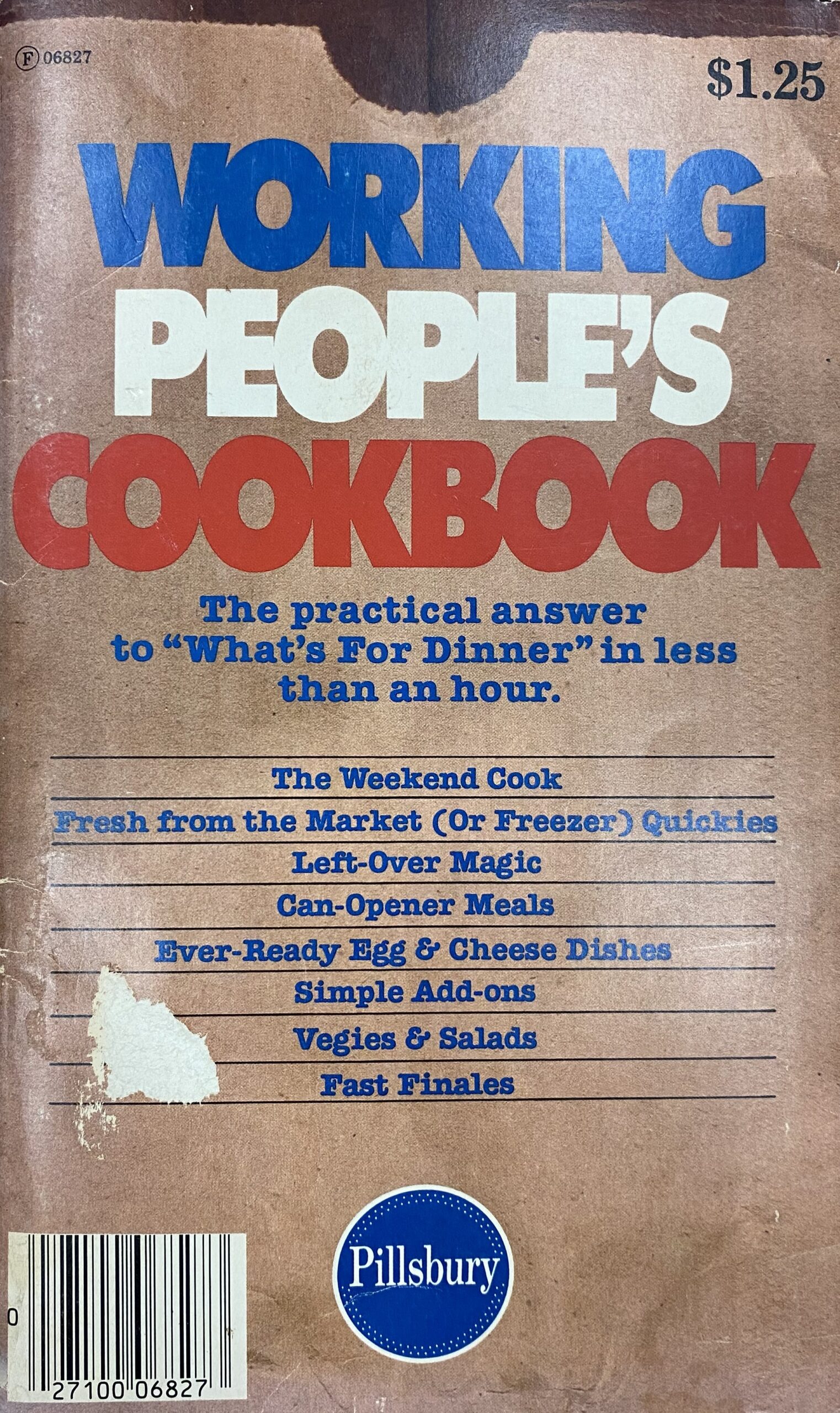
Working People’s Cookbook : The Practical Answer to “What’s For dinner” in Less Than an Hour (1976)
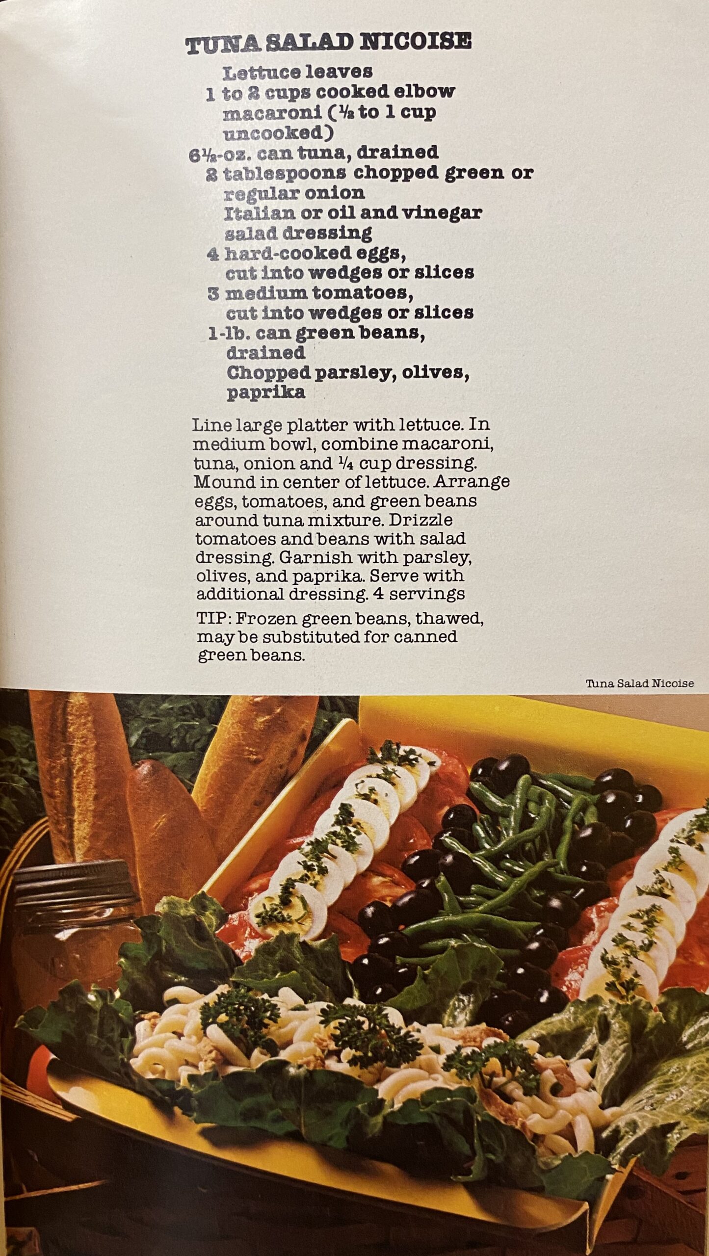
Salad recipe from Working People’s Cookbook (1976)
The collection has several educational cookbooks, which provide culinary instructions for people wanting to sharpen their culinary skills. There are also government sponsored cookbooks, which outline recommendations for food preparations, dietary guidelines, and often highlight agricultural products from the region.
Although these cookbooks reflect the time in which they were published (Jell-O salads!), the recipes are still incredibly fun to make, and turns out they can be quite delicious! To celebrate this new collection, the TMU Libraries staff who catalogued and processed the cookbooks recreated a dish from the collection to share with others (pictured below!) To view more cookbooks from this collection, stop by the Libraries’ 4th floor exhibition case by Archives & Special Collections, or explore the titles through our online finding aid.
If you’re looking for photographs from the 1940s to 1990s taken in Ontario, there is a wonderful collection at the Archives and Special Collections waiting for you!
2021_003_50_039_ Family Photographs
2021_003_50_039_ Family Photographs
The Collingwood collection was donated to the Archives & Special Collections in 2021 by a relative of the photographer. The collection consists of 35 mm and 2 ¼ negatives, prints, and textual records. The volume of the collection is high and it is being processed and it will be added to our database. A part of the collection consists of acetate based negatives suffering from vinegar syndrome. Vinegar syndrome is a term that refers to the odor of vinegar that is emitted due to hydrolysis of the acetate base of the negatives. The deteriorated negatives require special care and handling practices and due to their condition are not accessible for viewing in the reading room. The Archives and Special Collections is in the process of digitizing the deteriorated negatives before moving them to cold storage to increase accessibility to the collection.
2021.003.50.039 _Family Photographs
2021.003.50.041_Maclean Hunter
2021.003.50.041_Maclean Hunter
2021.003.50.041_Maclean Hunter
2021.003.51.002_Collingwood’s Portfolio
2021.003.51.002_Collingwood’s Portfolio
2021.003.51.002_Collingwood’s Portfolio
2021.003.51.002_Collingwood’s Portfolio
2021.003.51.002_Collingwood’s Portfolio
2021.003.51.002_Collingwood’s Portfolio
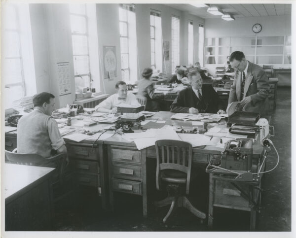
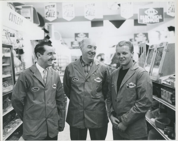
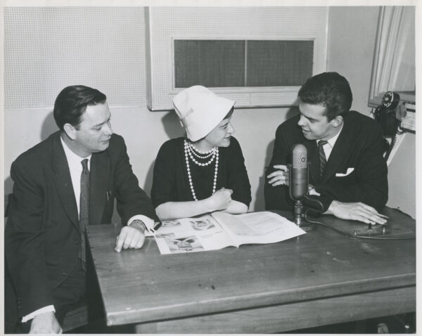
Harold Grant Collingwood was born on August 4, 1909, in Exeter, South Huron, Huron, Ontario and died at the age of 87 in May 1996. As an avid photographer, he photographed well-known jazz musicians, street views, buildings, events and venues. He was a commissioned photographer who took photographs for numerous companies namely the Mclean Hunter newsletter and Chatelaine magazine. In his portfolio, there are photographs depicting the office culture of the 40s to 90s in Canada. You will be able to find photographs of important events like the Eaton’s main store demolition and buildings like the old City Hall and the new City Hall. As a result of the variety of subjects that Collingwood photographed, this collection can be used for researchers who are interested in Toronto street views, events and even fashion between the years 1940 and 1990. Additionally, since Collingwood was commissioned to photograph events for companies and businesses, it can also be an excellent resource for researching the existing industries and businesses in Canada during that time period.
Drop by the Archives and Special Collections Department on the 4th floor of the library to see the current exhibition of the Collingwood collection. If you are interested in learning more about this collection you can check our database.
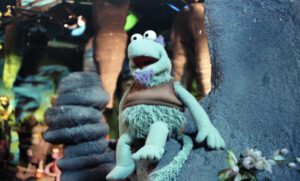
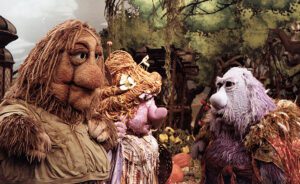
2012.005.02.055 Images from the set of Fraggle Rock, 1983-1987 by Robert Hackborn
This week the nostalgia machine has churned out never before seen images of everyone’s favourite puppet cartoon show, Fraggle Rock! Yes, you heard that right, Muppets.
2012.005.02.055 Image from the Fraggle Rock set, 1983-1987 by Robert Hackborn
Our collection includes nearly 600, full colour vintage negatives of everything from the backdrop, to the set, props, and of course the stars of the show; otherwise known as the supreme rulers of the universe, the Gorgs! Oh, and some Fraggles and Doozers as well. You can also see the amazing production team behind our beloved creatures, but rest assured the magic is still there once the illusion is shattered.
2012.005.02.055 Image from the set of Fraggle Rock, 1983- 1987 by Robert Hackborn
These images provide a once in a unique intimate opportunity to see the innerworkings of how the internationally acclaimed TV show was produced. The collection was graciously donated by the Canadian production designer Robert Arthur Hackborn who workers for the CBC. His work as a set designer and a film director have greatly influenced the trajectory of the creative vision of multiple productions, not just Fraggle Rock. Make sure to check out the rest of his donated works of audio visual, photography, published materials, textual records, objects, and graphic materials!
We’re joining the Archives of Ontario in their #ArchivesAtoZ month-long campaign. The aim is to increase the public’s awareness of archives and their collections. We’ll be sharing four blog posts throughout the month showcasing items and collections from our holdings or archival concepts related to each letter of the alphabet.
April 4: A to F
April 11: G to M
April 18: N to S
April 25: T to Z
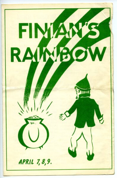
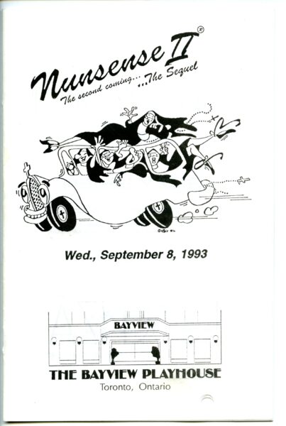
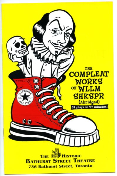
Theatre Programs
Did you know we have more than 2700 theatre programs in our collection, including 638 published by Toronto companies between 1959 and 2012? Some of the programs have the original ticket stubs and paper inserts from the attended performance. Here are a few examples from local theatres & acting groups:
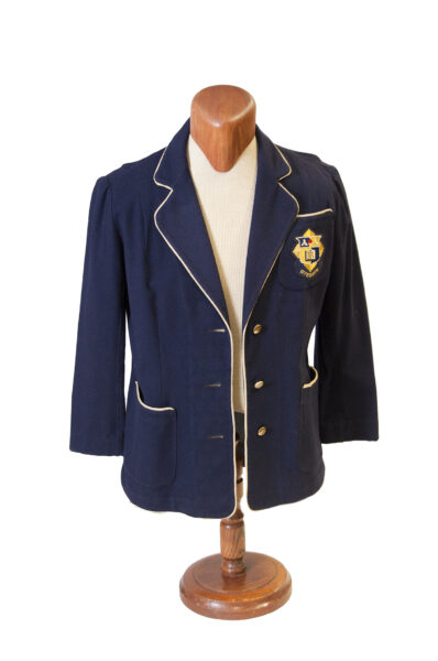
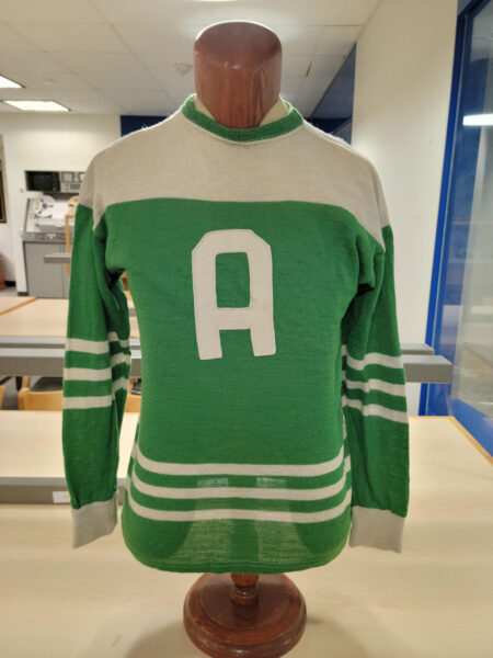
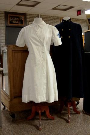
We are lucky enough to be home to a large selection of textiles/clothing – everything from nylons to rally caps. A large part of these collections are uniforms of different types. We have school uniforms, athletic uniforms, nursing uniforms, and even old mascot costumes in uniform. Here is just a sample of what we have.
Ryerson blazer featuring the school’s 2nd crest, (1951-1960)
Architectural Intramural Hockey jersey (1954-1957)
Toronto General Hospital – Wellesley Division Nursing Uniform (1948-1959) and Cape (1953-1956)
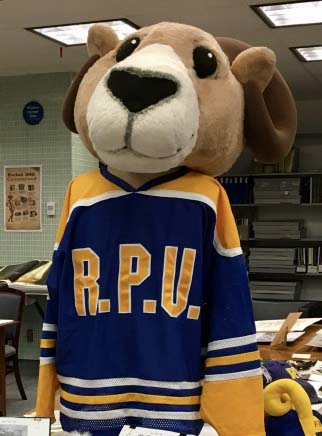
Eggy mascot costume head and Ryerson Polytechnic University Hockey jersey
Vinegar Syndrome
Vinegar Syndrome – this is something that most Archives and Special Collections have to deal with especially those that house large collections of film and photography. Acetate film bases were first introduced in the early 1900s as an alternative to the highly combustible nitrate film and was in use between the 1930s and the 1990s.
One of the major preservation concerns with acetate film, both in motion picture and still photography, is vinegar syndrome. As the film base starts to degrade (usually caused by levels of high temperature and humidity) there is a build up of acetic acid (the vinegar smell!). As the syndrome progresses the film begins to suffer from shrinkage, embrittlement, and buckling of the gelatin emulsion eventually making the film unplayable and the photographs illegible.
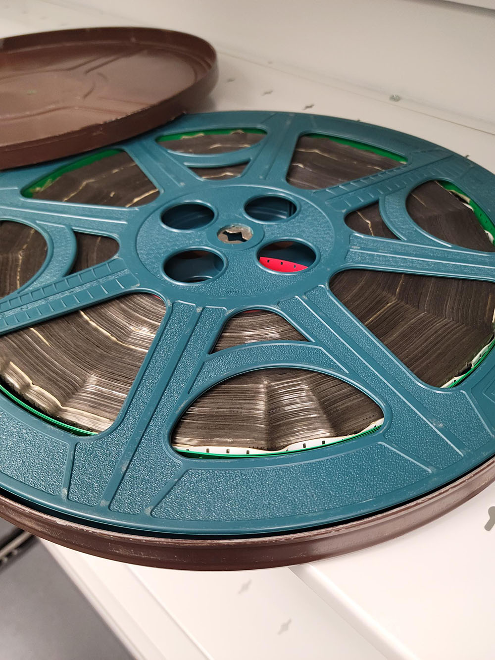
3 x 5 inch black and white acetate negatives16mm Film reel
William Notman
Willian Notman immigrated to Montreal from Scotland in 1856 and founded what would become an internationally known photography studio. Notman photographed mostly prominent politicians and notable families but he was also well known across local athletic clubs and social groups.
He became known for his large composite group portraits and innovative portraiture techniques. The composites were made by assembling multiple individual portraits through a collage. Notman also hired artists to paint realistic backdrops for his portraits in order to re-create outdoor settings in his studio.
His photography business expanded quickly and by 1872 Notman had 26 studios across North America. The company was renamed William Notman & Son in 1882 when his eldest son William McFarlane Notman, became a partner.
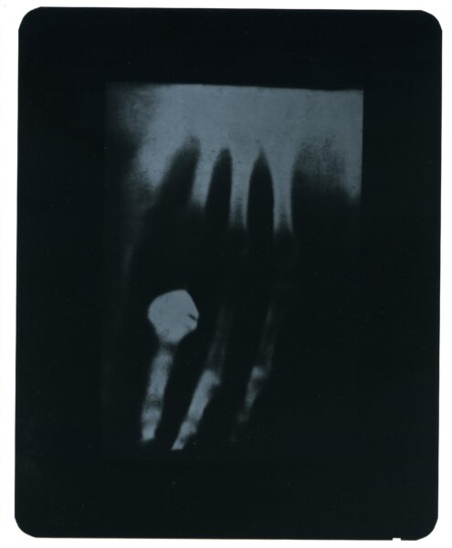
X-Rays
This image is copy of the x-ray Wilhelm Conrad Rontgen took of his wife’s hand in 1895. Kodak reproduced the image in 1970 to celebrate the 75th anniversary of Rontgen’s discovery of x-ray imaging. This copy was made using their KODAK RP/D X-OMAT Radiograph Duplicating Film.
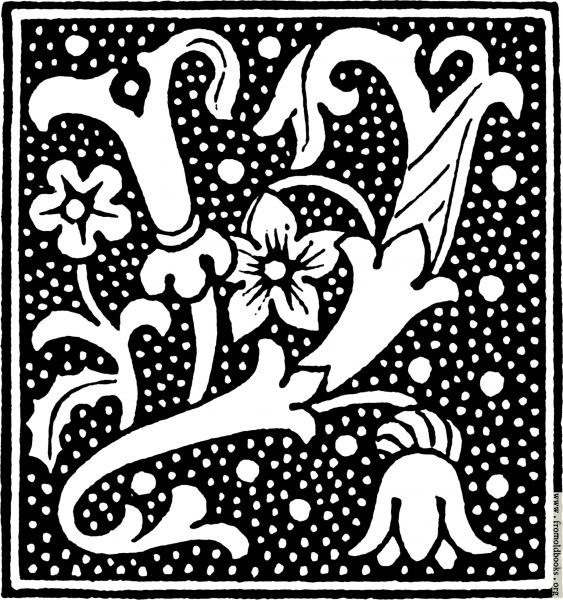
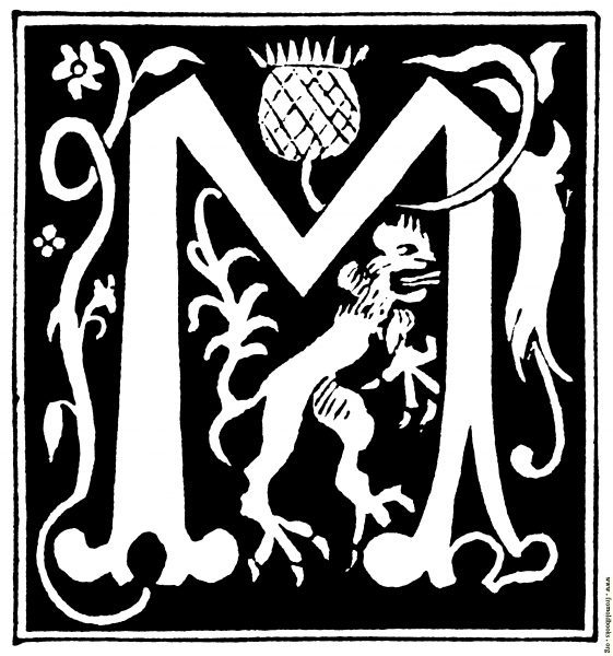
Yellow Book
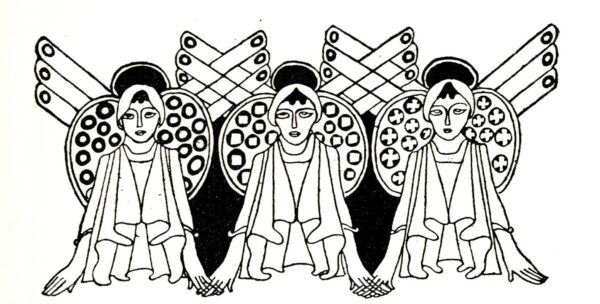
The Yellow Book is a Victorian magazine that published 13 quarterly editions between 1894 and 1897. The book’s bright yellow cover was a nod to the illicit French fiction novels of this era. The Yellow Book distinguished itself from other fin-du-siècle magazines through its division of literary and art content (treating each as standalone piece) and its avant-garde and lavish aesthetic (minimalist layouts and spacious margins). This magazine didn’t include advertisements and focused on the book itself being a piece of art rather than a vessel for information. Aubrey Beardsley was the magazine’s first art editor. The magazine published several of his extravagant Japanese-woodcut inspired black ink illustrations (as seen on the book cover below).
The Centre for Digital Humanities has a website dedicated to the time period, which became known as the Yellow Nineties. Issues of The Yellow Book have been digitized and can be viewed online.
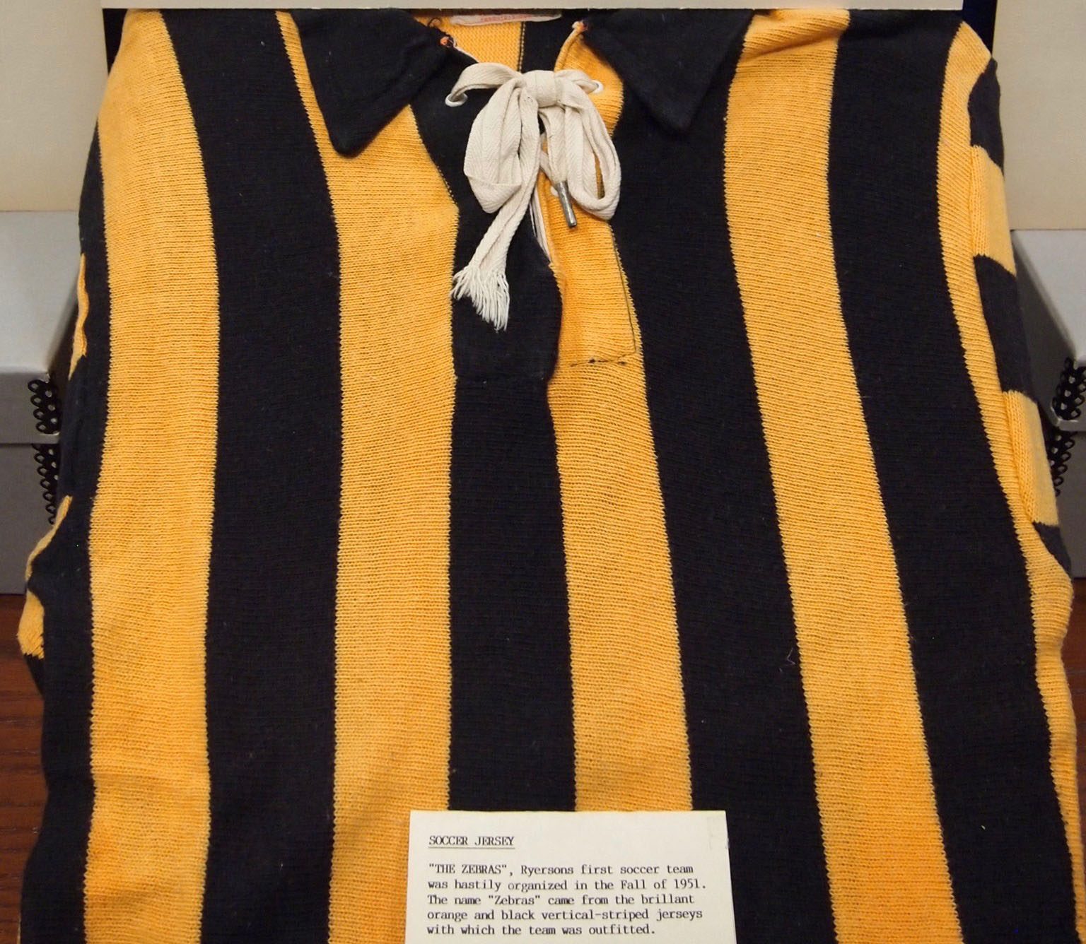
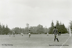
The Men’s soccer team in the early days of the School were called the Zebras for their bright gold and blue jerseys. The team debuted in 1951. They were intermediate champs in 1956-1957 and Intermediate Ontario-Quebec Conference Champions in 1958-1959. In 1964 they switched to the Ontario Intercollegiate Athletic Association and in 1965 changed to a bright orange/yellow jersey from the striped jersey that gave them their name. The Zebras continued under that name until the 1973-1974 school year when they became Rams.
Blue and Yellow Men’s soccer Jersey.Men’s Zebra’s Soccer Team on the field, 1953. Photograph taken by then coach C. Roy Horney
We hope you have enjoyed our Archives A to Z blog post series. Explore the hashtag #ArchivesAtoZ to see what other repositories have shared online!
We’re joining the Archives of Ontario in their #ArchivesAtoZ month-long campaign. The aim is to increase the public’s awareness of archives and their collections. We’ll be sharing four blog posts throughout the month showcasing items and collections from our holdings or archival concepts related to each letter of the alphabet.
April 4: A to F
April 11: G to M
April 18: N to S
April 25: T to Z
Names on Campus
Have you wondered about names around campus? Let’s take a peek at two individuals connected with two campus buildings.
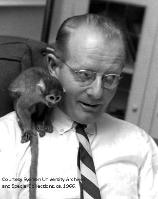
Jorgenson Hall was named after Fred Jorgenson, who, in 1966, took over as principal from retiring and founding principal, Howard H. Kerr. An extensive campus expansion being planned included the construction of a consolidating administrative building. Ten days before the turning of the sod, Jorgenson announced his unexpected resignation, effective July 1969, due to family illness. The building received its name in his honour. Jorgenson Hall officially opened in late 1971.
Fun facts about Fred Jorgenson :
Highly unusual at the time, he asked faculty to call him by his first name.
His title changed from principal to president in 1967.
The family pet was a monkey named George.
Believing in a tight-knit community, he went to a hospital to confer a diploma on a graduating, ill student.
The student body referred to him as “Uncle Fred”.
He worked diligently for Ryerson’s authority to grant degrees (first degree granted 1971).
He sent Christmas greetings to the Ryerson community every year into the 1980s.
Fred Jorgenson died at 93 in June 2016.
Fred Jorgenson with George, 1966
Oakham House, the original structure facing Church Street, was designed and named by its architect, William Thomas. Born in 1799 to Welsh parents in England, Thomas arrived in Canada in 1844. Little is known of the Thomas family life in Toronto other than he was married to Martha and had 10 children, three of whom died young, aged 2 months, 14 and 17 years, and two others who joined him in business. He was prolific in his building designs in both England and Ontario.
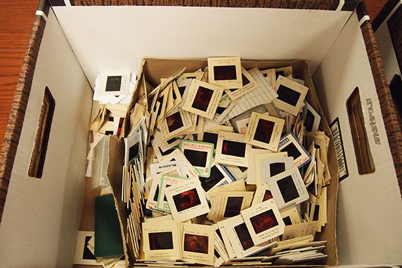
One of the two fundamental principles used when arranging Archival records. The idea behind this principle is that it is not just the records and the information within them that is important. It is the context in which the records were originally used and organized that is equally important – adding to the history of those records. Once the records have been donated to an Archive, the records’ organization will be maintained and no other order will be imposed (alphabetical, numerical, chronological).
That being said – if there is NO obvious original order – an Archives will arrange the materials in a way that makes the most sense in relation to the nature of the records.
Box of slides – no organization and no obvious sign of original order
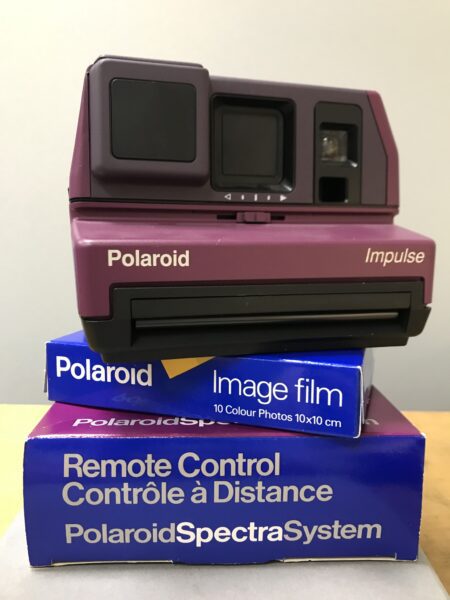
Polaroid
Our Polaroid collection has over 200 instant cameras! The collection was donated by a former Polaroid employee and includes some unique publications, camera manuals and promotional material from the company. The Polaroid Corporation was a leader in instant cameras and film, but the company’s initial research focus was on polarizers. The company developed polarized lenses and filters for various uses, which led to the creation of instant photography in 1947.
Questions about Archives? Not sure what is a Special Collection?
We’re here to help answer those questions and support patrons navigate the world of archival research! If you want to know more about what collections are available at Archives & Special Collections (or A&SC) and how to search them, a great place to start is our Research Guide.
Some of the most common questions we get are:
Do I have to wear gloves?
In most cases you don’t! The use of white cotton gloves are a common misconceptions in libraries and archives (see this fun blog by the Smithsonian on the topic!) Cotton gloves can actually damage material by getting caught on the edge of an object or a torn piece of paper. We prefer that researchers arrive with clean hands before handling the material. The only instance when gloves need to be used is when handling prints or negatives that are not in protective housing.
Can I copy or take photos of the material?
Yes, you are welcome to take reference photos of the material for research or private study during an appointment. There are some cases when it is not possible, if there are privacy concerns for instance, but our staff will let you know beforehand.
Can I check out this book?
Unfortunately not. We love patrons to use our collections, but items in Archives & Special Collections must be kept in our reading room. Books and records in our holdings can be unique, fragile or may require special handling. We don’t want to limit access to our collections, but by keeping them in the reading room we can ensure that future generations will have access to them!
Robert MacIntosh Collection
The Robert Macintosh City of Toronto Book Collection contains historical and contemporary publications on the history of Toronto. Macintosh donated this collection to Special Collections in 2013 (he is also the author of one of the books titled Earliest Toronto). The collection includes 141 books on the history of Toronto, featuring tourist guides and souvenirs about the city from the late 19th and early 20th centuries.
You can see the full list of books from this collection in the library catalogue.
Storage
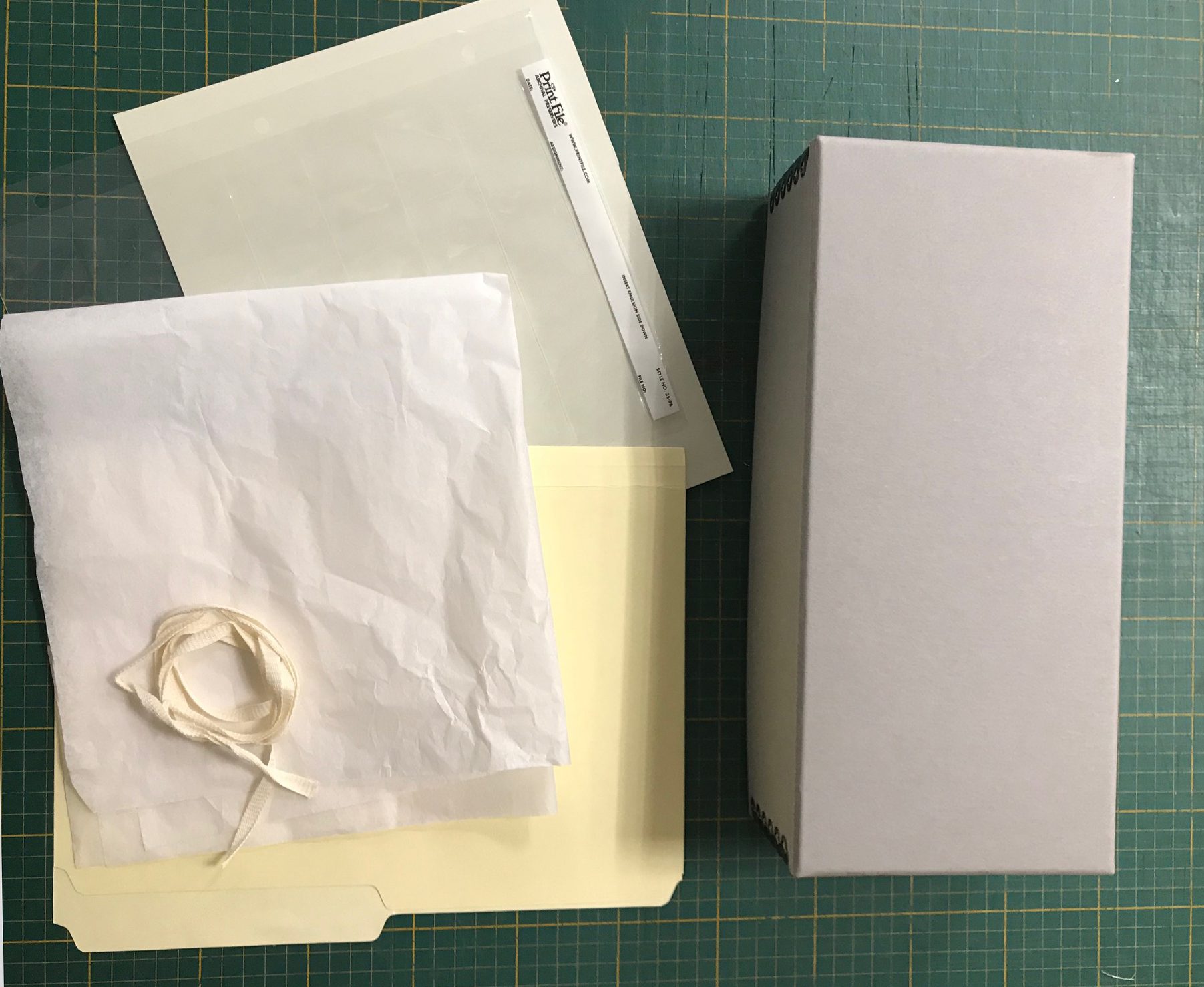
Storage can mean two things – What we re-house the materials in and where we store them once they have been re-housed.
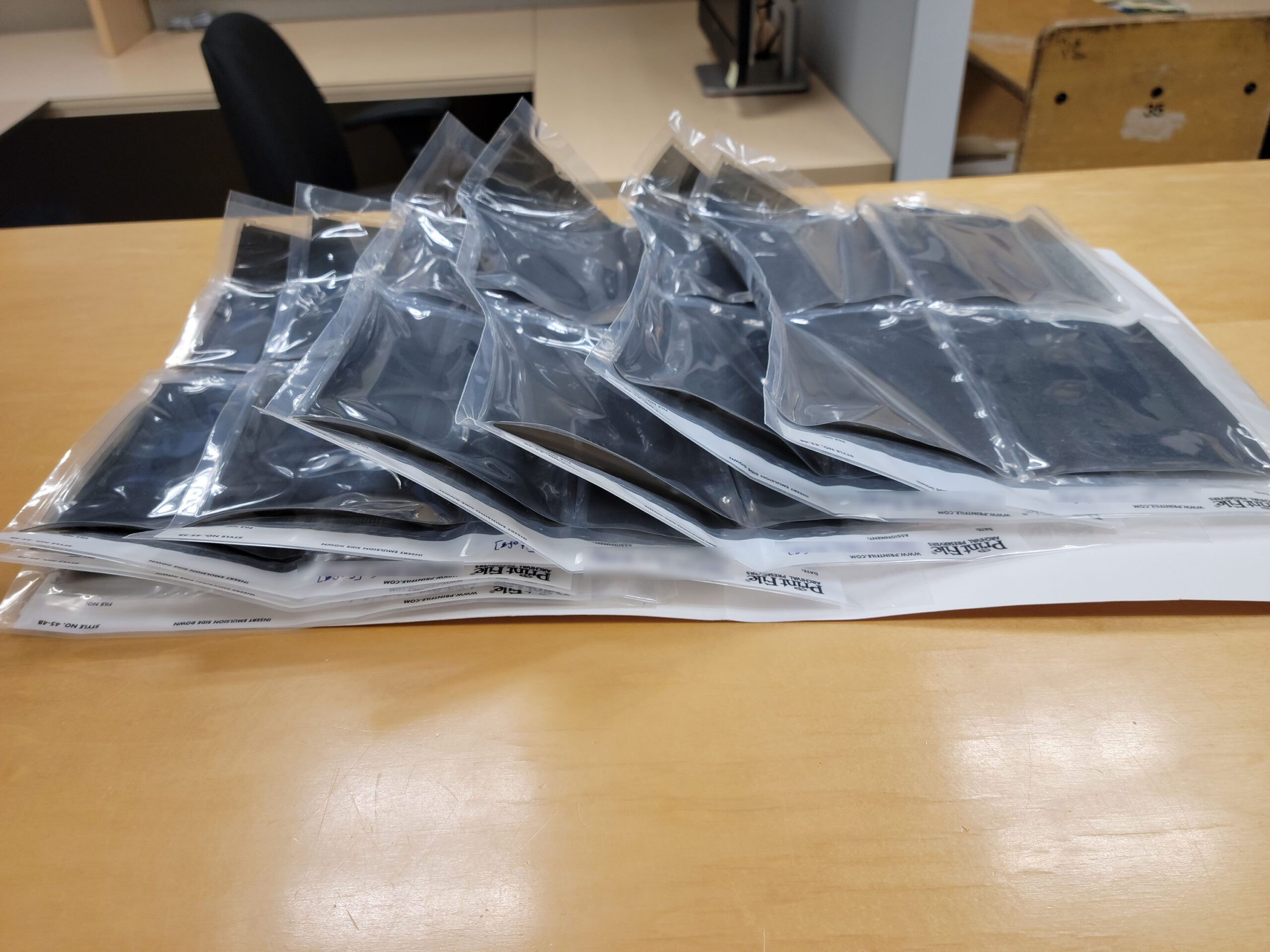
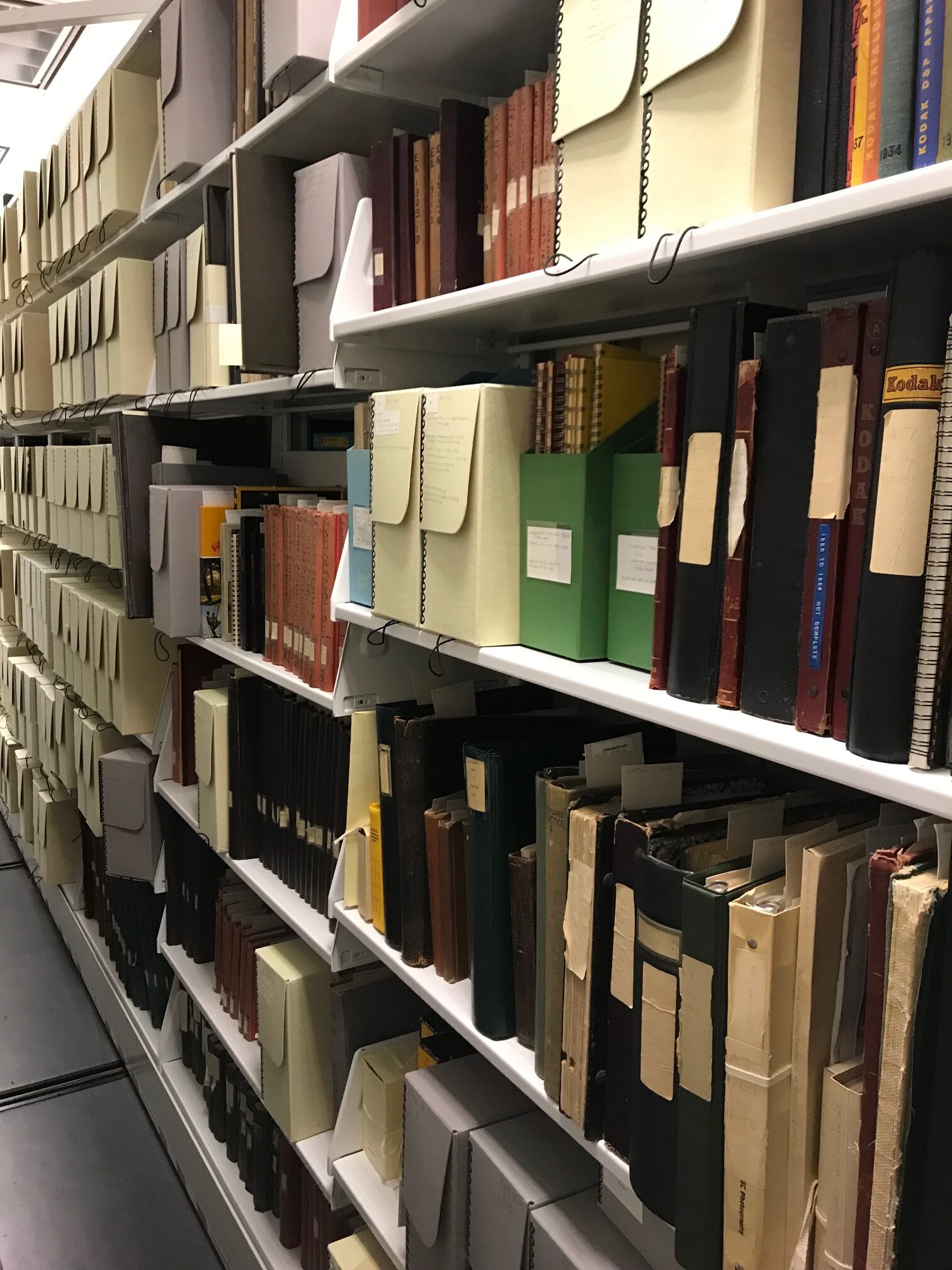
One of the last steps in preparing new donations for entry in our collections is re-housing them. When records and objects are delivered to us they are usually in their original file folders, boxes, and housing that, in the long run, can be harmful to the materials. For example, file folders may be replaced with acid free folders and placed in special archival boxes that help protect the records and prolong their life. Photographs are often placed in neutral see-through sleeves that enable the photographs to be seen, but protect the print from the damage that handling can cause. Because of the varied make up of most Archives and Special Collections, there is a wide variety of materials, cases, and boxes that are available for re-housing from a small case to house a coin to an 8ft long box made to house gowns and dresses. The Canadian Conservation Institute has published “CCI Notes” – guides for the care, handling, and storage of a wide variety of materials – you can access them at Canadian Conservation Notes
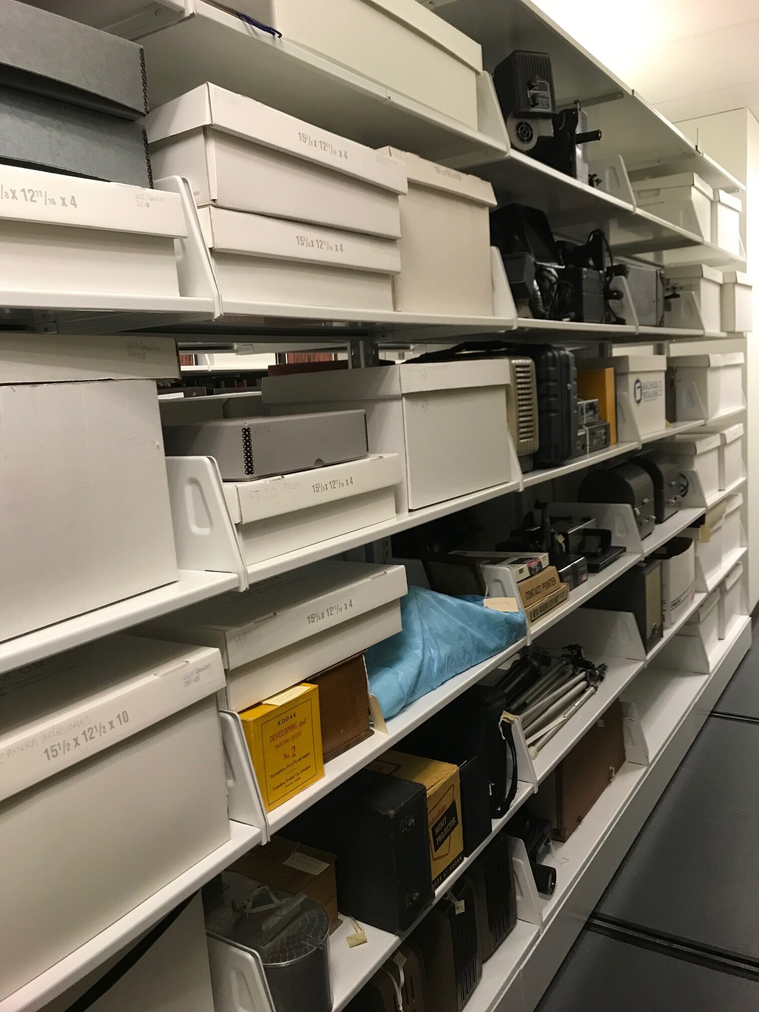
Storage also means the shelving and room(s) where the collections are stored. The one universal truth across Archives and Special Collections is that, with collections constantly expanding, there never seems to be enough room! Storage can range from a small closet to a state of the art climate controlled vault. At our Archives and Special Collections we are lucky enough to have compact storage – which greatly increased our storage footprint.
Some of the typical items we use to re-house our collections. File folders, files boxes, acid free tissue, twill tape, and photo sleeve.View of compact shelving and variety of storage box types and sizes.View of the compact shelving in our storage room.
Next week, in our final April post, we’ll highlight items and archival concepts for the letters T to Z!
We’re joining the Archives of Ontario in their #ArchivesAtoZ month-long campaign. The aim is to increase the public’s awareness of archives and their collections. We’ll be sharing four blog posts throughout the month showcasing items from our collections and demystifying archival concepts related to each letter of the alphabet.
April 4: A to F
April 11: G to M
April 18: N to S
April 25: T to Z
Graphic Materials
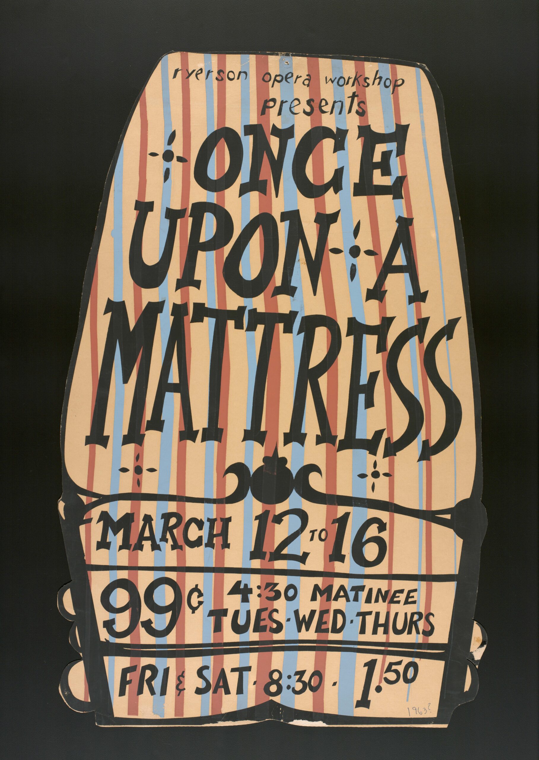
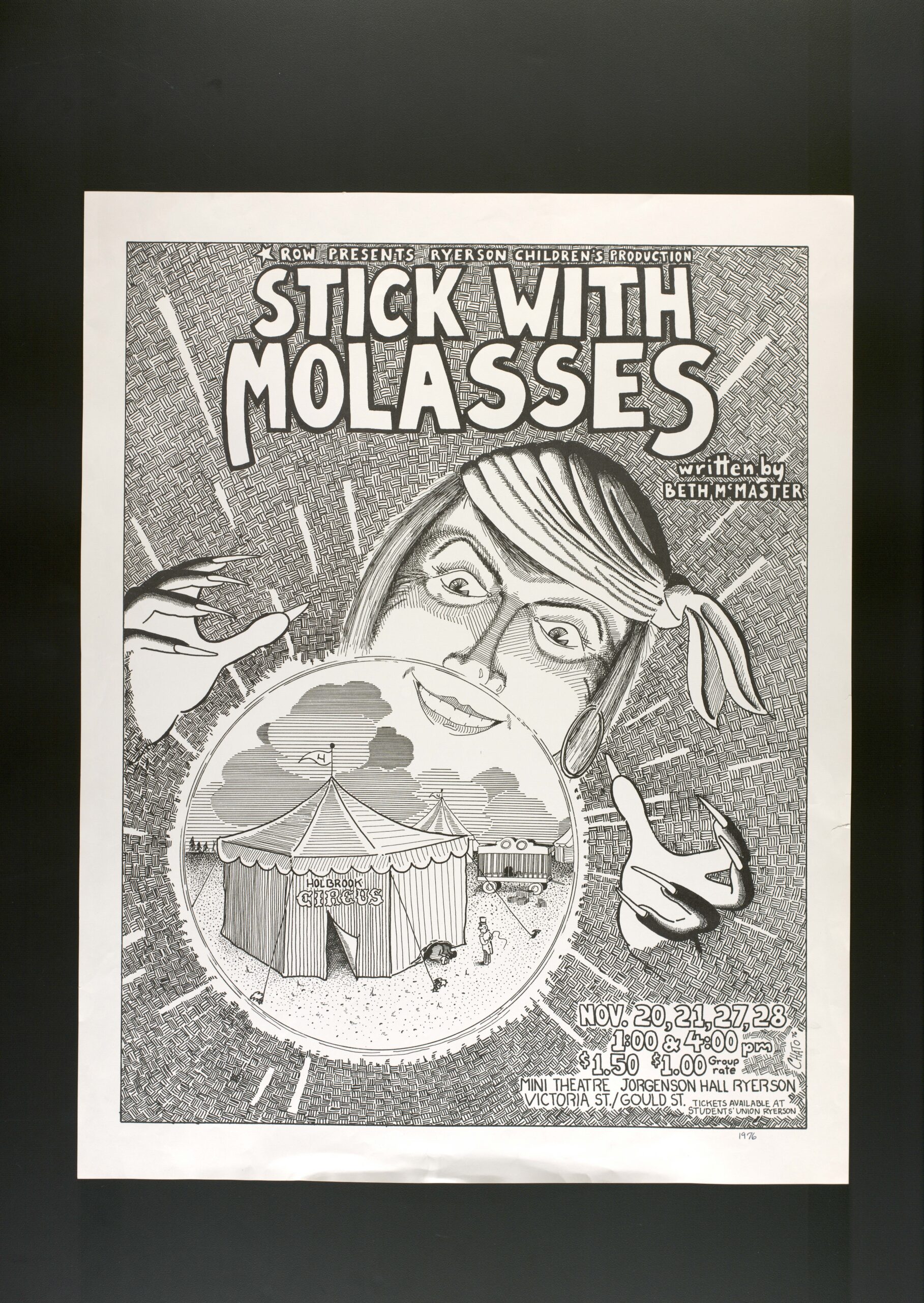
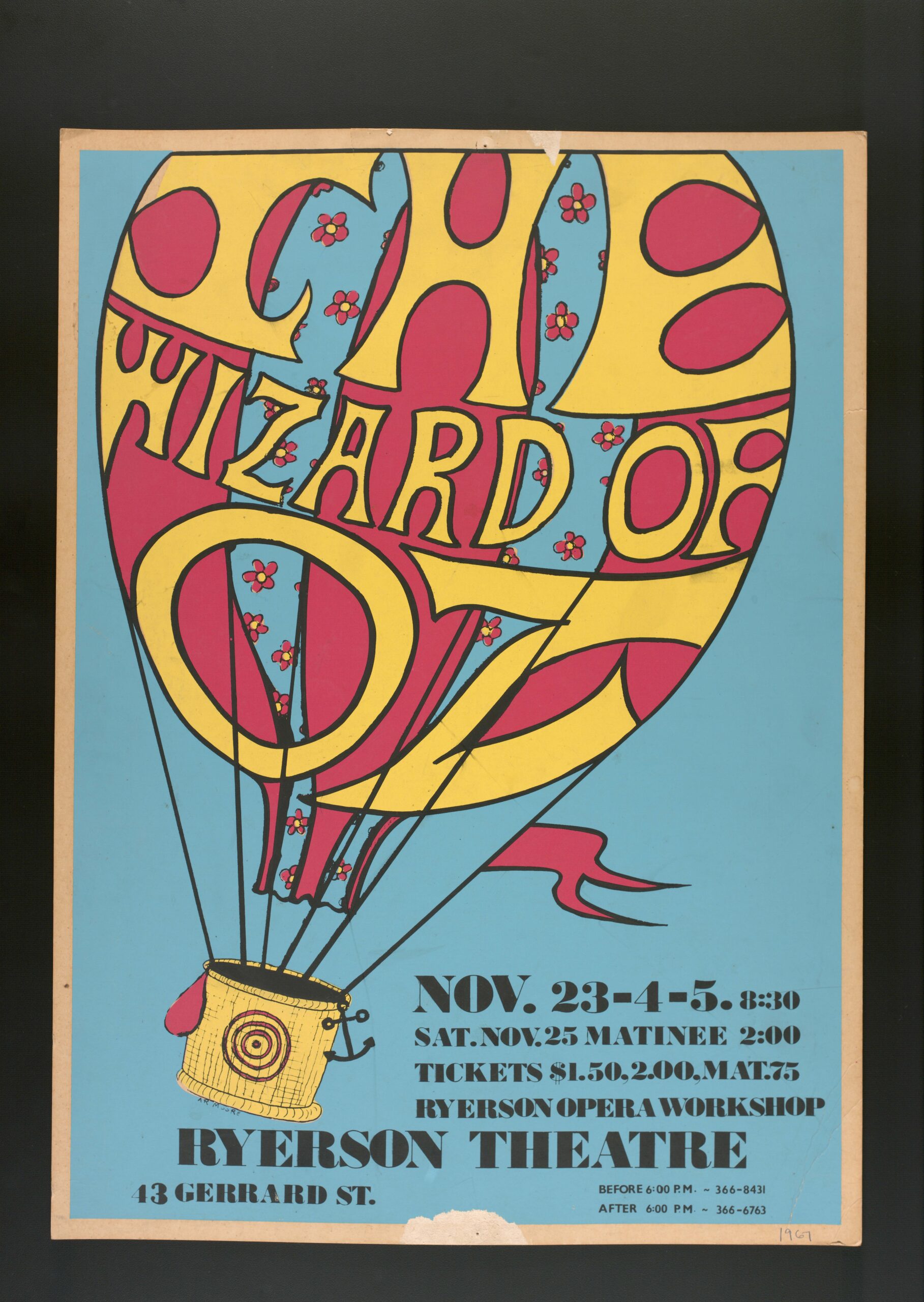
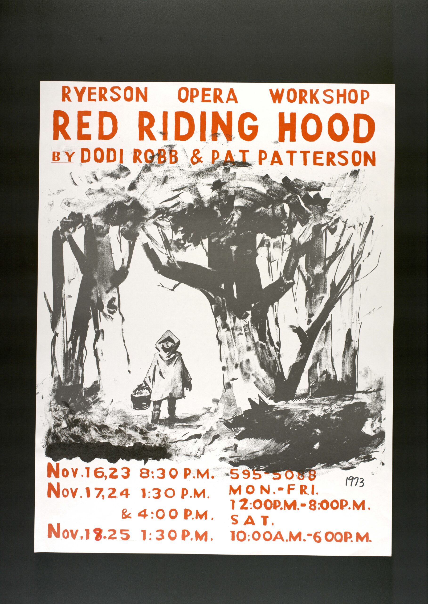
According to the Canadian Council of Archives graphic materials are “…are defined as documents in the form of pictures, photographs, drawings, watercolours, prints, and other forms of two-dimensional pictorial representations.” This definition includes a diverse range of materials and processes that often make up the bulk of an Archives or Special Collections holdings. While conducting research last year – we came across these amazing hand painted and hand drawn theatrical posters created by students to advertise Ryerson Opera Workshop productions. The Ryerson Opera Workshop, or ROW, was established in 1951 by Jack McAllister, at the time faculty in the English Department and would later be one on the founding faculty in the School of Performance. The workshop was an institute-wide, student endeavour from production crew to cast members.
Ryerson Opera Workshop presents “Once Upon a Mattress”, 1963Ryerson Opera Workshop presents “Stick with Molasses”, 1976Ryerson Opera Workshop presents “The Wizard of Oz”, 1967Ryerson Opera Workshop presents “Red Riding Hood”, 1973
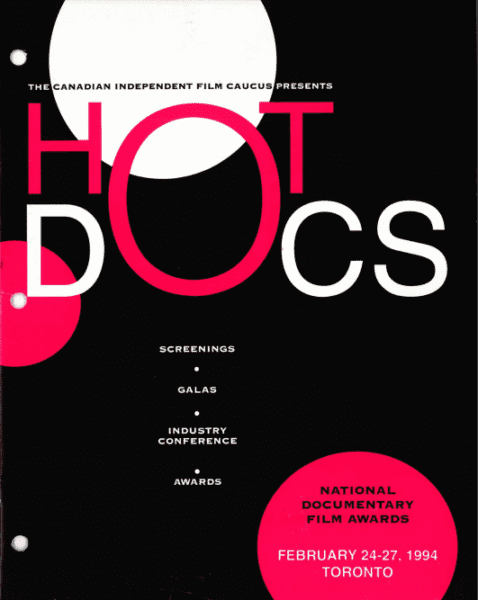
Hot Docs
The Hot Docs Fonds includes physical and digital material produced for the annual Hot Docs Canadian International Documentary Festival. Digital copies of the programs from 1994 to 2001 festivals can be viewed on our database by clicking on the program’s cover images. We’re looking forward to this year’s festival, which begin on April 28th !
Imaging, also known as digital imaging, reformatting, scanning or digitizing, refers to creating an electronic representation of an analogue object. The are several standards for imaging cultural heritage material, such as the Federal Agencies Digital Guidelines Initiative (FADGI) and the Canadian Heritage Information Network (CHIN).
We generally use a flatbed scanner for graphic material, and an overhead copy stand for large prints and 3-D objects. We also digitize audiovisual formats such as VHS tapes and audio-cassettes, since they tend to deteriorate quickly and the playback equipment required for reformatting is becoming less readily available (a tape deck or a VCR for instance.)
We often get asked why libraries and archives can’t digitize all of our collections for online access! The Peel Art Gallery Museum + Archive has a blog post with great answers to this question, but it generally is tied to the amount of resources required for mass digitization (staff time, technical equipment, digital storage, copyright clearance, etc.) Take a look at what we’ve digitized so far through our online database!
An example of imaging using a copy stand. We use colour bars to identify the scale of the object and to have reference for tone and colour balancing.
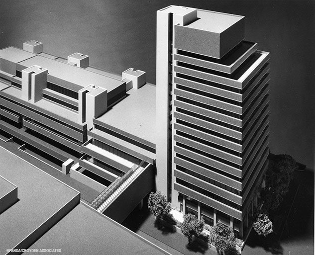
Jorgenson Hall Model
The Jorgenson Hall/Podium/Library Building architectural model is one of three campus building models in our collections (the other two being Pitman Hall and the RAC). This one was created by Webb Zerafa Menkes Housden Architects Engineers and shows the three buildings plus the west side of Kerr Hall which attaches to the complex via footbridges at either end.
Jorgenson/Podium/Library model by Webb Zerafa Menkes Housden. Photographed by Panda/Croyden Associates. (RG 122.10.021)Jorgenson/Podium/Library model on the stage platform as part of the ground breaking ceremony for the complex held in June of 1969. Photograph taken by former professor C. Roy Horney (F 536.16.167)
Keyword Searching
Keyword searching can be hit and miss when it comes to looking for archival records – especially if you are starting your research in an internet search engine. Every search comes back with hundreds of thousands of returns – so how do you improve your chances of finding what you are looking for?
Having a plan of action that includes an initial list of keywords is a good way to start. When thinking of what keywords you want to use there are several things to keep in mind:
1) The age of the records you are looking for and the time period of their creation – terminology is ever evolving and you may find your search returns include offensive and outdated terminology that is no longer in use, but would have been at the time of the records creation
2) Word spelling – countries may spell words differently so include all the potential spellings of your keywords when you are searching.
3) Alternate/previous names – this is especially important if you are researching a geographic location – has it always been called what it is named now?
Finally – consider adding some of these terms to the end of your keywords: papers, photographs, collections, exhibition, primary source, archives, special collections, library, museum, curriculum. Any or all of these terms may help narrow down your search and help you find what you are looking for. Robin M. Katz’s “How to Google for Primary Sources” has some other suggestions to help you with your search.
Lorne Shields
Lorne Shields has been an avid collector of bicycles and bicycle ephemera since 1967. His passion for bicycles led him to collect photographs on the subject as well as books, magazines, and bicycle memorabilia.
Shields donated his collection of photographs unrelated to bicycles to Special Collections in 2008. This includes studio portraits and carte-de-visites as well as landscape and industrial imagery from the Victorian era to the 1960s. The collection also comprises many vernacular photographic albums, good examples of glass and metal photographic processes including cased daguerreotypes, ambrotypes and tintypes. Explore our database for more information on the Lorne Shields Historical Photograph Collection.
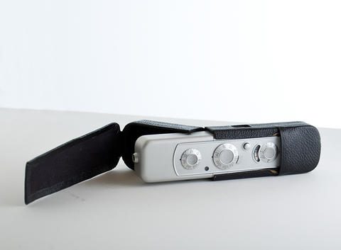
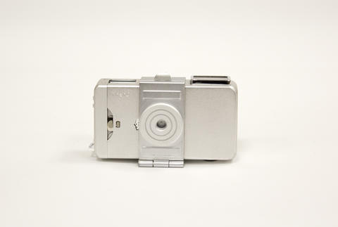
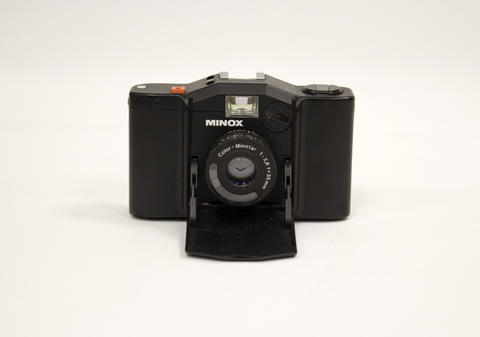
Did you know we have several miniature and sub-miniature cameras in the collection? These mini photo devices are designed to take photographs on film sized smaller than 135 format (24mm x 36mm). The Minolta-16 camera seen below takes 10×14 mm exposures on 16 mm film.
Miniature cameras gained a reputation as “spy” cameras, and while some of the higher quality ones (including the Minox) were used by government agencies, most were simply for amateur use.
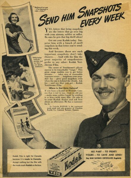
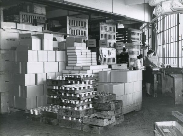
Kodak is most likely known for its photography related wart efforts, such as their advertisements encouraging citizens to send images to soldiers or the Vest Pocket camera sold as “The Soldier’s Kodak.”1 Nevertheless, they were also supporting wartime demands through employee initiatives and by shifting their manufacturing plants at Kodak Heights in Toronto.
A group of employees organized the Kodak War Efforts Club to send packages overseas with sweets, knitted goods and magazines. In addition, they partnered with the Red Cross to host a weekly Kodak Blood Clinic and rewarded employees with badges for recurring donations.2
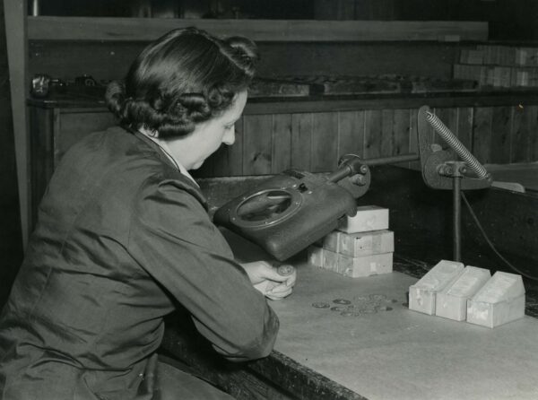
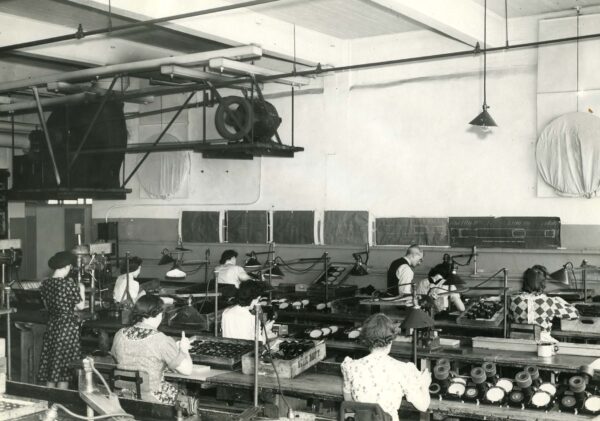
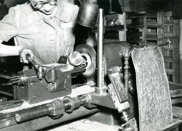
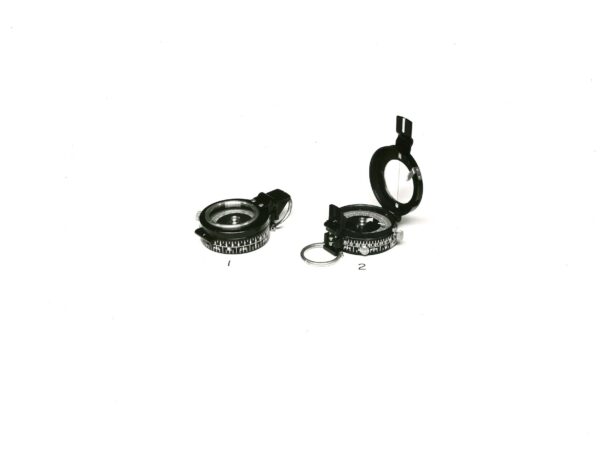
In 1941, Kodak Heights was approached by the Department of Munitions and Supply to manufacture compasses. They had previously built tools and parts for combat airplanes, but this was their first venture in producing instruments for the armed forces.3 As seen in many sectors, women stepped into manufacturing positions during the war, and Kodak was no different in finding new roles for women to support the production of compasses.
In their internal employee publication, the company celebrated this endeavour and shared positive feedback received from the U.S. War Department as well as their own employees who were redeployed in the war fronts and recognized the C.K.C engraving (Canadian Kodak Company) on a compass.4
Kodak Heights even exhibited images of the compass in the Employee Building cafeteria to promote the initiative among staff. These images may have remained on the walls as a memory of their war efforts, because by fall of 1945 Kodak had already pivoted back to its regular production of cameras and photographic material.
Kodak had several internal magazines which provide incredible first hand accounts of the day to day life at the company. Running from 1936 to 1955, “KODAK: A Magazine for Kodak Employees” was a bimonthly internal publication designed to communicate the activities of Canadian Kodak and its employees. For more information on war efforts at Kodak Heights, explore the publications in our database or on the Internet Archive for online versions.
Roger, Andrew C. ‘Amateur Photography by Soldiers of the Canadian Expeditionary Force’. Archivaria, vol. 26, no. January, 1988, pp. 163–68.
‘Kodak Meets the Wartime Challenge (Part 1)’. KODAK: A Magazine for Kodak Employees, vol. 1, no. 3, Apr. 1945, pp. 1–2.
‘Kodak Meets the Wartime Challenge (Part 2)’. KODAK: A Magazine for Kodak Employees, vol. 1, no. 4, May 1945, pp. 1–3.
We’re joining the Archives of Ontario in their #ArchivesAtoZ month-long campaign. The aim is to increase the public’s awareness of archives and their collections. We’ll be sharing four blog posts throughout the month showcasing items and collections from our holdings or archival concepts related to each letter of the alphabet.
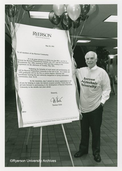
Opened in 1948 as the Ryerson Institute of Technology, Ryerson has been granting degrees for 49 years – the first of which were handed out on May 26, 1972 to graduates in Interior Design, Business Management, and Geodetic Sciences. Nineteen years later, almost to the day, on May 27, 1991 the Ryerson Board of Governors and Academic Council (Senate) gave their support to the proposal the the school seek full university status. Two years later on June 1, 1993 the dream was realized when Ryerson Polytechnic University was recognized by Royal Assent. The oversized letter and the T-shirt in this picture are housed in Archives and Special Collections (RG 122.12)
Photograph of Terry Grier stands beside the oversized letter announcing Ryerson’s full University Status (RG 76.14.723). Click on the photo above to read the announcements published in the University’s Forum Newsletter.
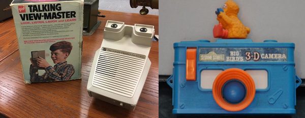
View-Masters
The Bass Stereoscopic Photography Collection has 162 pieces of stereo viewing equipment, including 44 View-Masters. These stereoscopic viewers first appeared at the 1939 New York World Fair. View-Masters, a name trademarked by Sawyer’s Inc, use circular “reels” with seven stereoscopic images made from 16mm Kodachrome transparencies. Unlike the original wooden stereoscope viewers, View-Masters are usually made of plastic or metal.
Our collection has a variety of different types of viewers, such as the GAF Talking View-Master, which incorporated an audio record that synchronized sound with the stereoscopic slides. The Big Bird camera-shaped 3D viewer, a staff favourite, has a built-in reel of 7 diametrical, 16 mm colour transparencies of Sesame Street characters teaching the alphabet.
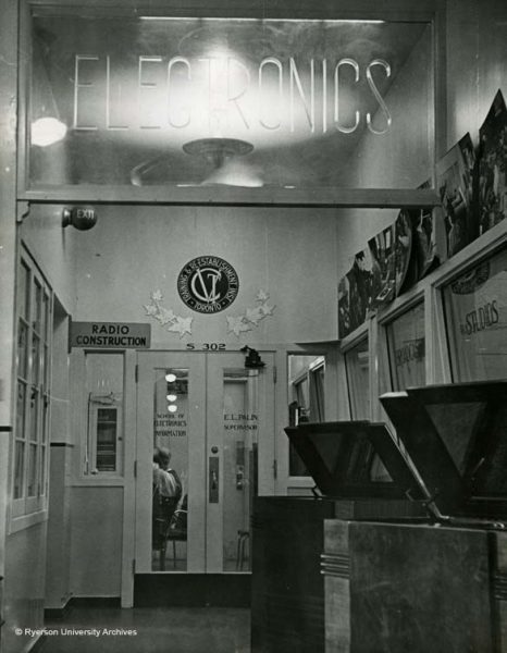
Did you know Toronto Metropolitan University had a connection to World War II? The original building on campus Ryerson Hall, whose façade is the entrance to the Ryerson Athletic Centre in the Kerr Hall Quad, housed both the Royal Canadian Air Force Initial Training School No. 6 and the Dominion-Provincial War Emergency Training Program between 1941-1945. To learn more about the Royal Canadian Air Force’s training facilities visit their web page At the end of World War II, the building would house the Training and Re-establishment Institute (TRIT), a place for veterans to learn a trade. TRIT ran between 1945-1948, and Ryerson Institute of Technology, which opened in September 1948, evolved out of that organization – offering the same courses in the first couple of years of our existence. Take a look at RG 58 Vocational Training Schools and Training and Re-establisment Institutes, F 183 James A. Moore fonds and F 858 Michael Zabinsky fonds to see more records we have related to the Training and Re-establishment Institute.
Interior view of the Electronics Department of the Training and Re-establishment Institute (RG 58.18)
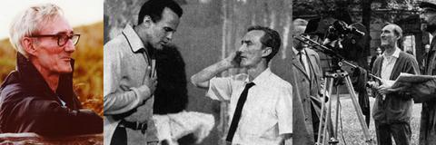
XV Winter Olympic Ceremony
The Paddy Sampson Fonds consists of textual records and audiovisual material related to television shows and specials intended for broadcast on the Canadian Broadcasting Corporation’s (CBC). Sampson joined the CBC as a stage hand in 1952, and later became a producer and director for the broadcaster. Some of the notable programs he worked on include “Program X” and the renowned hour long 1966 music special, “The Blues”. The Fonds also contains research material related to Sampson’s independent productions, such as the 1988 opening and closing ceremonies for the XV Winter Olympics in Calgary.
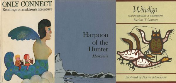
Special Collections’ book holdings include the Children’s Literature Archive. The collection was established through the Centre for Digital Humanities in 2009 and was transferred to Special Collections in 2017. It contains over 2200 books published between 1701 and 1940 and continues to grow. Its particular strengths are adventure stories, fairy tales, and Canadiana, but also includes strong holdings in poetry, picture books, and pedagogical works such as science texts and primers, along with biographies of notable authors and other scholarly studies. Explore the collection through the Centre for Digital Humanities’ exhibition website or through the Library catalogue.
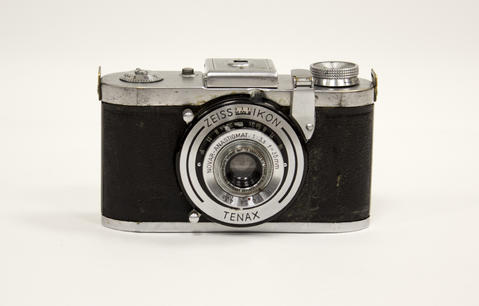
Our Heritage Camera Collection has over 677 pieces of photographic equipment, including several cameras by the company Zeiss Ikon. Zeiss was initially an optical workshop in Germany during the mid-1800s, and started building camera lenses in the 1890s. Zeiss Ikon was created in 1926 by the merger of four camera manufacturers: Contessa-Nettel, Ernemann, Goerz and Ica. The newly founded partnership combined thousands of cameras patents held by the individual companies. Explore the Zeiss website for more information on the history of the camera company.